Email Best Practices
The following are a few best practices to be used when creating email signatures or composing promotional email messages. Following these guidelines will provide a better experience for email users.
Email Signatures
No logos or graphics should be used in university email signatures.
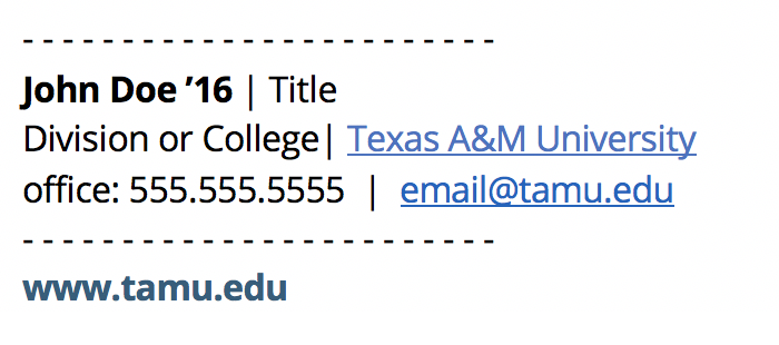
DO:
Do use minimal formatting.
Do use caution when selecting colors.
Example:
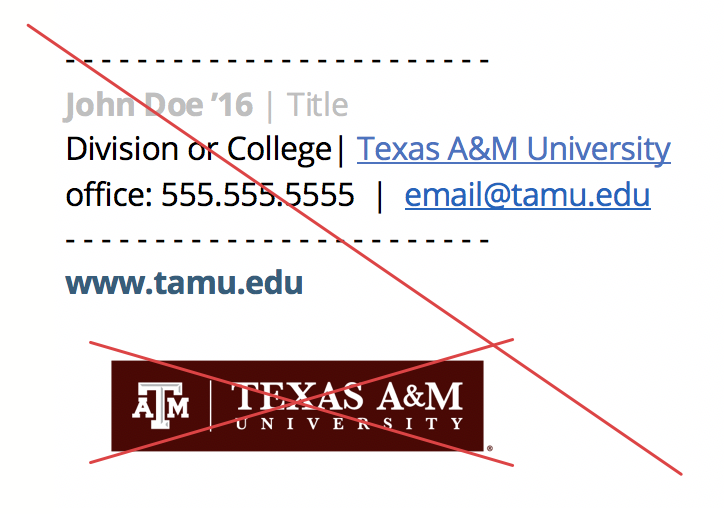
DON'T:
Don't use JPGs, PNGs, or any other image types.
Don't use low-contrast colors.
Example:
Promotional Emails
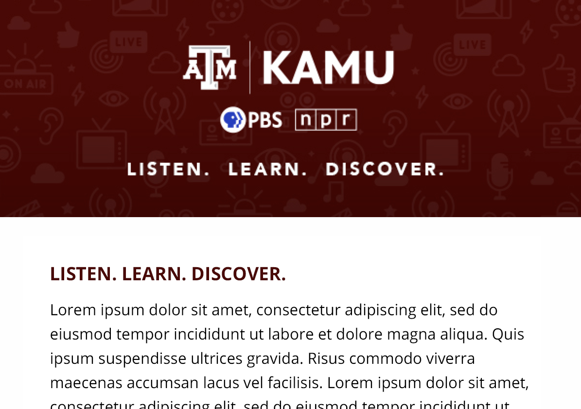
DO:
Do use the TAM Logo Box in email image headers.
Example:
DON'T:
Don't use the White TAM Logo on backgrounds that aren't maroon.
Example:
DO:
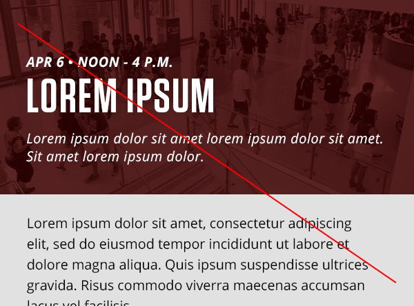
Do be considerate of persons with disabilities and use header images for decoration rather than communication.
Note: If text must be used in the header image, also include it in the email body as a text heading.
Example:
DON'T:
Don't place text (other than a logo) in header images whenever possible.
Example: