Brand Colors
Besides consistent use of logos, another unifying visual component is consistent use of color. The university color palette was created to complement our signature color, Aggie Maroon™.
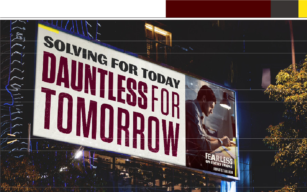
AGGIE MAROON™
For 4-color Offset Printing
C=15 M=100 Y=39 K=69
Custom mix for spot-color Offset Printing:
Pantone® Yellow 012 9.00
Pantone® Rubine Red 36.00
Pantone® Black 25.00
Pantone® Trans. White 30.00
For Pantone® Number Requirements:
Pantone® 7421C
Print Color Palette
The colors below are for printed materials. Both Pantone spot colors and CMYK percentages have been provided. Every print technique is different and print proofs may be required to ensure color accuracy.
The Digital Color Palette is referenced in the web section of this site.
Primary Colors
PMS 7421
C-15
M-100
Y-39
K-69
White
C-0
M-0
Y-0
K-0
Secondary Colors
PMS 541C
C-100
M-58
Y-9
K-46
PMS 7498C
C-46
M-23
Y-84
K-68
PMS 463C
C-14
M-54
Y-95
K-62
PMS 4505C
C-16
M-27
Y-83
K-42
PMS 7C
C-67
M-63
Y-63
K-57
PMS 422C
C-19
M-12
Y-13
K-34
PMS 7527C
C-3
M-4
Y-14
K-8
Accent Colors (to be used sparingly)
PMS 102C
C-0
M-0
Y-95
K-0
PMS 185C
C-0
M-95
Y-79
K-0
Color Proportions
The primary color palette is the basis of the overall color scheme. Aggie Maroon should always have a strong presence. Secondary colors are used in smaller proportion and should never overwhelm the primary colors. Accent colors are utilized in small amounts to highlight or balance compositional elements. The segmented bars below represent the percentages of colors used in each piece.