Photography Practices
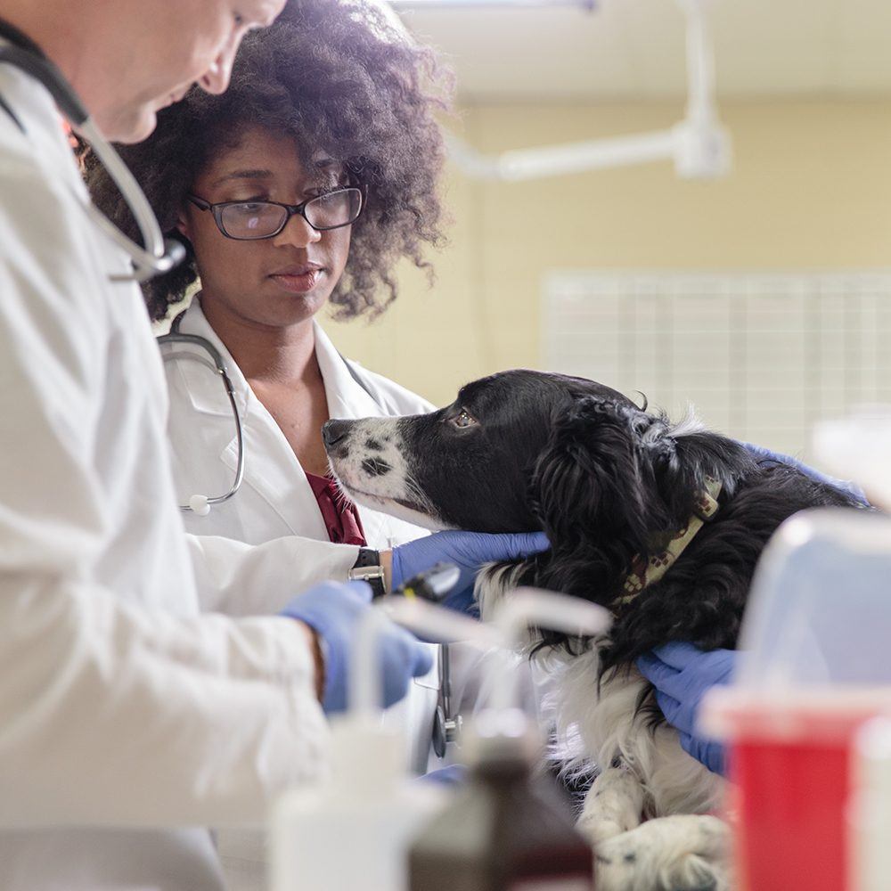
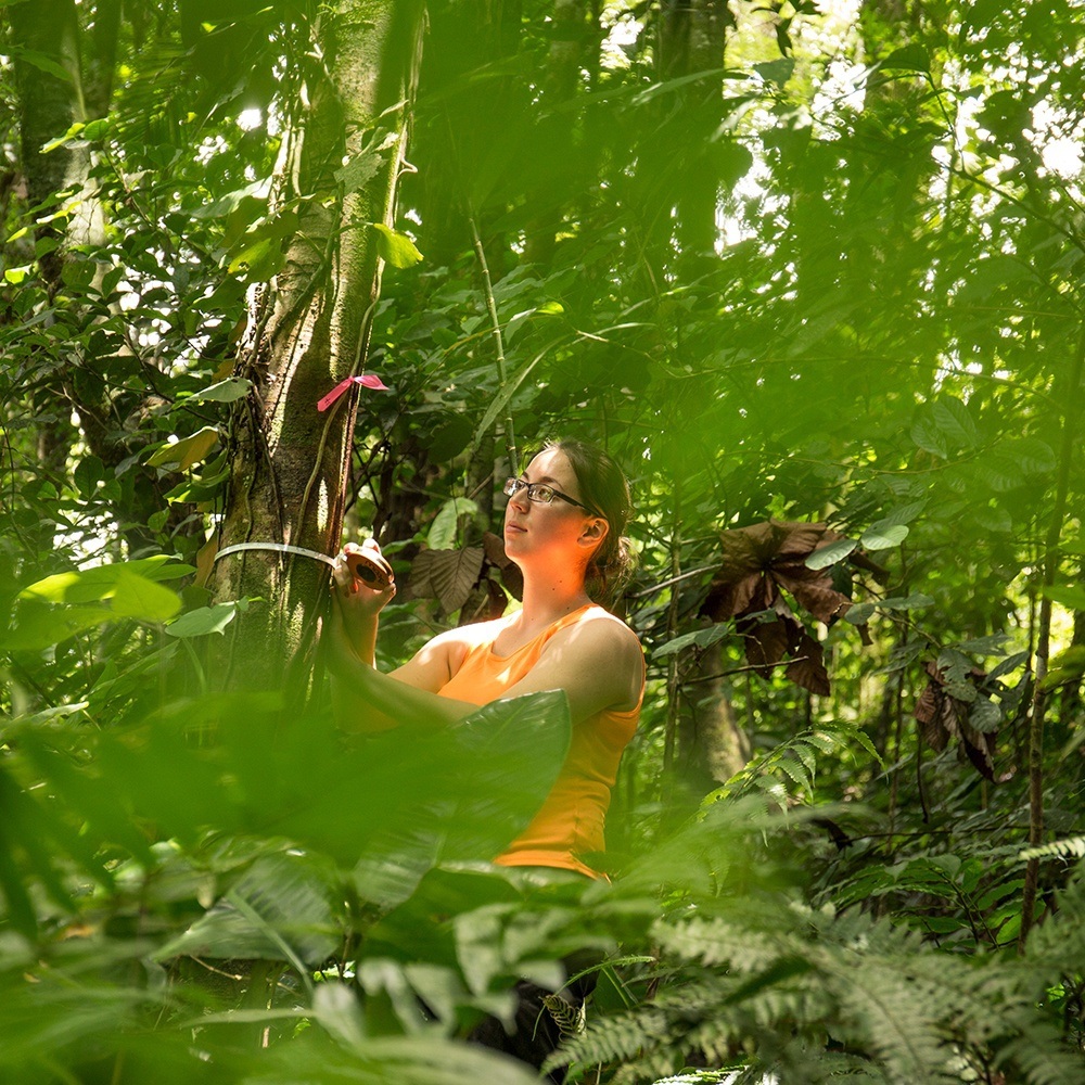
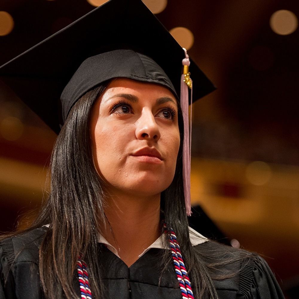
The photography style should feel modern, diverse, and natural. Whenever possible, show the subject in action and interacting with relevant props. The action should feel spontaneous and realistic. Each photo should feel like a glimpse into the hard-working real world of Texas A&M.
Do:
- Do aim for realistic and candid photos
- Do show subjects engaged in activity
- Do have working/studying subjects appear focused and studious
- Do show a clear purpose/topic for working/studying photos (genetics, meteorology, etc.)
- Do have recreational photos that are inclusive and lively
- Do have subject dressed normally or in appropriate attire for the activity shown
- Do show populated and active campus/building shots
- Do show a range of compositional techniques across the entire photo library
Don't:
- Don't over-stage subjects
- Don't have subjects interacting with or looking at the camera (except portraiture)
- Don't show subjects unengaged with their setting (except portraiture)
- Don't show generic studying shots where the purpose/topic is not clear
- Don't over-brand subject's clothing
- Don't show sedentary, unengaged subjects
- Don't use flat, one-dimensional compositions
- Don't over-light scenes
Color Correction
There are a few simple steps to creating consistent, rich photography for use across all marketing materials. The specific values will vary depending on the original image but the idea is to create a warm, crisp image, with clear contrast and vibrant color.
STEP 1 - Create a Brightness/Contrast adjustment layer. Increase the contrast to get rich blacks and sharp highlights.
STEP 2 - Create a Color Balance adjustment layer. Add warm tones and reduce cool tones for highlights, mid-tones, and shadows. Be careful not to oversaturate. The colors should still appear natural but should have a subtle warmth.
STEP 3 - Output the image in the appropriate color mode. RGB for digital, CMYK for print.
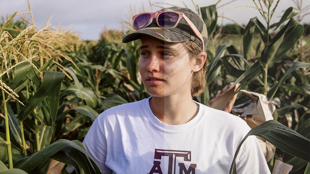
Original vs. Adjusted
Tone-On-Tone
Tone-on-tone photography can be used to complement full-color images or as a background element. Use the color values below to guide your editing processes.

Maroon Duotone

Gold Duotone

Charcoal Duotone
Maroon Duotone
Shape: C=15 M=100 Y=39 K=69
Image: C=52 M=100 Y=90 K=90
Gold Duotone
Shape: C=16 M=27 Y=83 K=42
Image: C=42 M=64 Y=100 K=69
Charcoal Duotone
Shape: C=67 M=63 Y=63 K=57
Image: C=87 M=79 Y=80 K=73